Tuesday, October 8, 2013

LIKE ICING ON THE CAKE!

"IT'S A MUCH NICER LOOK, I SAY IT'S LIKE PUTTING ICING ON THE CAKE. IT JUST ADDS THAT MUCH MORE PIZZAZZ TO THE KITCHEN"

-SAYS GARY SCHMIDT REGARDING BACKSPLASHES IN A KITCHEN.

My blog this week comes from the article 'Backsplashes are bigger than ever-literally' by Anne Kapler featured in The Gazette which can be found around the Cedar Rapids area. This article talks about how backsplashes add a great deal to a kitchen and how they actually serve a purpose. They never used to be used because people were afraid it would be hard to clean in between the grout lines. But backsplashes keep splatters from staining the walls and actually make cleaning easier because you can just spray and wipe. With regular painted walls, you can get staining, water marks, and sometimes have to worry about taking the paint off. White ceramic subway tiles and colorful glass tiles that are installed from the counter to wall cabinet are extremely popular. Sometimes people even bring the tile all the way to the ceiling. While they are really popular there are other options which include porcelain, stone and various exotic materials.

Backsplashes are a nice way to add something extra to your kitchen. All kitchens have cabinets and appliances that vary depending on style but a backsplash is one element that can make a kitchen stand out.

Mary Jo Peterson who is a columnist for Kitchen & Bath Design News, says that there is a way to have a backsplash that is easy to tear down if you want something different or if you want to go bold but are afraid you won't like it. She suggest installing a backsplash on a removable board instead of directly onto the wall.

Below are some examples of different ways to incorporate backsplashes into a kitchen: 


Wednesday, September 25, 2013

OH, TO BE IN ENGLAND!

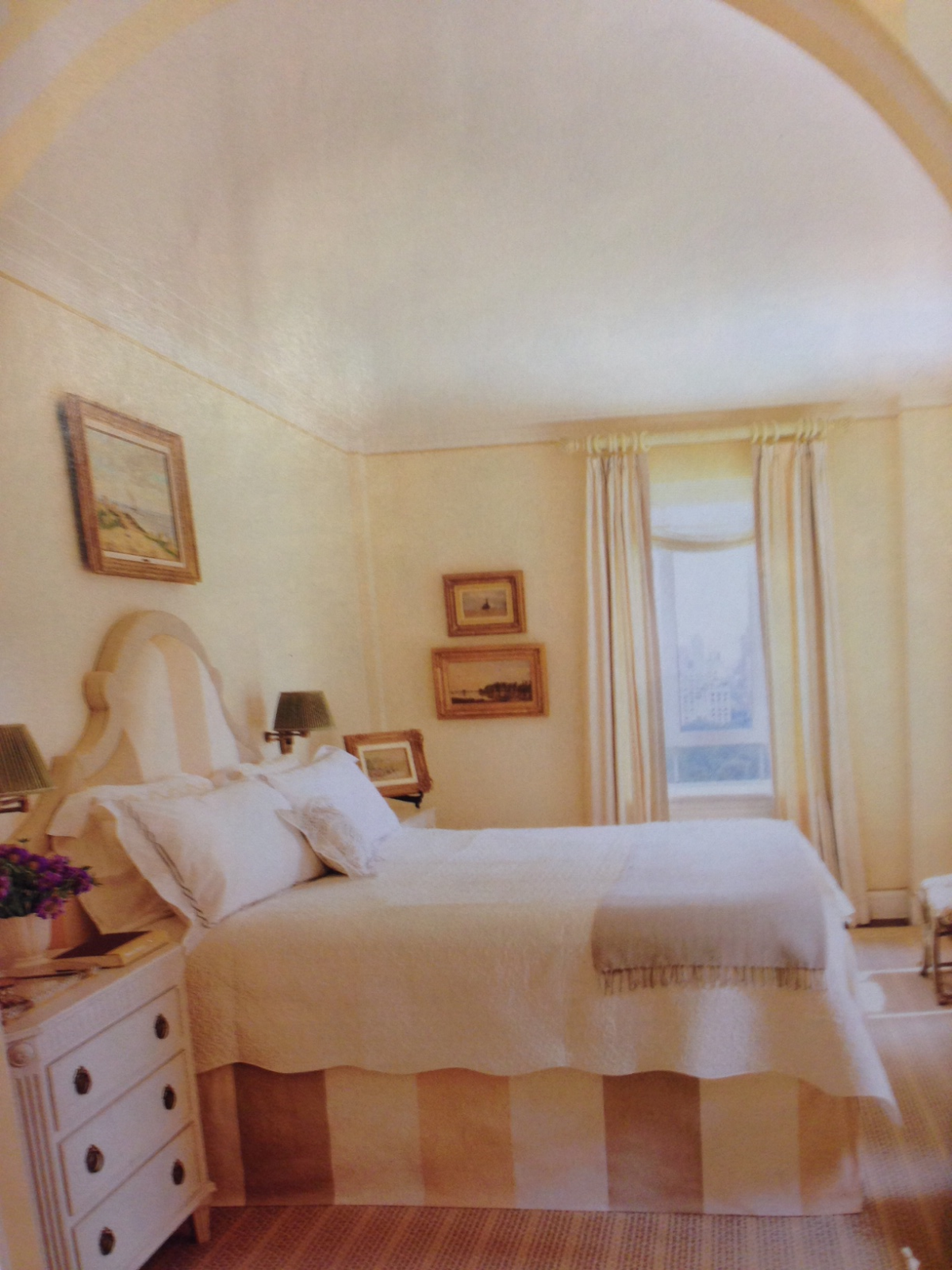
"London Calling" written by Lisa Cregan was published in the October 2013 addition of Traditional Magazine and talks about how after living in London for 10 years, Lynn Eichenberger and her family sadly moved back to the United States after her husband was relocated and how she and architect James Wagman and interior designer Celerie Kemble turned her Manhattan duplex into a "place with the kind of Old World character and grace their homesick client had grown accustomed to". The space was completely gutted where they could almost completely start from scratch. They kept the design traditional yet at the same time finding ways to make it interesting. For example, the dining room, with the dark paint, painted on not only all the wall but all the molding and trim as well. Throughout the home is antiques and ceramics the Lynn has collected while living in London. When looking at these pictures I see a kind of the old world charm you find in Europe. While living in Manhatten, the Eichenberger family should feel right at home!


Tuesday, September 10, 2013

BLACK AND WHITE: TOGETHER FOREVER

"EVERY ROOM NEEDS A SLAP IN THE FACE" 

                                                 -Dransfield and Ross co-owner Geoffrey Ross

A lot of people say that nothing is ever just black and white. Well, I disagree! Some of the world's greatest things come in black and white, such as;
OREOS

OLD MOVIES
                                                                 
PIANOS


HOSTESS CUPCAKES


PAGES OF A BOOK

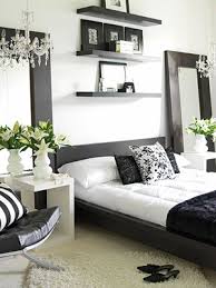
I could go on and on! It's like black and white were always meant to be together. In the article "Bold Moves" by Tori Mellott and Mimi Faucett in the September 2013 issue of Traditional Home Magazine, they go through what to do when designing in black and white. One of the tips talked about is how you should combine a soft black with a creamy white. If you pick a harsh black with a bright white it creates a high contrast which often is too harsh.


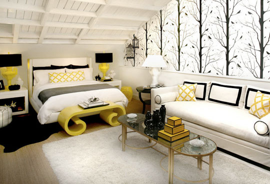
What's great about using black and white is that you can add in almost any accent color. They say you should steer clear of yellows and oranges as accent colors because they resemble bees and Halloween otherwise but they can look great if done right!


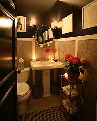
 They say white subway tiles and black soapstone countertops in a kitchen look really great along with using an oversized black and white wallpaper in a powder room or even a hallway. 


Great paints they tell us to use when using a black and white color scheme are "Off-Black" from www.farrow-ball.com

"Onyx Black" from  www.glidden.com


and "Atrium White" from www.benjaminmoore.com


Tuesday, August 27, 2013

WHY DO I HAVE SO MUCH STUFF?

"CLEANING YOUR HOUSE WHILE YOUR KIDS ARE STILL GROWING IS LIKE SHOVELING THE SIDEWALK BEFORE IT STOPS SNOWING."
                                                                                         -Phyllis Diller

A lot of people have the problem of having too much stuff with no where to put it. As a 22 year old student that only works part time, and still lives with her parents, I either have way to much stuff or too little of space. The only place I have to put all my stuff is in my bedroom because the rest of the house is filled with all my parent's stuff. So if you are like me and live with your parents, maybe you have kids in the house (we all know having kids means having a lot of stuff), or maybe you just have way to much stuff in general, this post can help you out. I read "11 Ways to Maximize a Small Space" by Jen Renzi. on www.housebeautiful.com. Even if you are simply designing a space these tips can be useful.

TIP #1: CREATE ZONES
Think about all the things you do in a particular space and create different zones or areas for each activity done. 

TIP #2: EMBRACE CHANGE
Choose furniture that serves more than one purpose. If can save on space help with the clutter. You can also pick furniture that can be moved or collapsable when not being used. That way the room can change when or if you need it to. 

TIP #3: TRICK YOUR EYE
You can design a space to make it look bigger than it is such as furniture placement, the use of mirrors, furniture scale, the use of window treatments, ect... 

TIP #4: MAKE EVERY PIECE COUNT
When choosing furniture, keep in mind the function needed in the space and select furniture for maximum functionality. Every little bit of space helps especially if there is a lot of traffic flow. 

TIP #5: USE BIGGER-BUT FEWER FURNISHINGS
Having a few large pieces of furniture is way better than filling a space up with a lot of smaller furniture. By using larger scale furniture, it fills the space up more which than oddly makes the room appear larger. 

TIP #6: VISUAL CONTINUITY CREATES CALM
Light Colors help make a room look bigger and creates a calming, soothing space.

TIP #7: CUSTOMIZE
By customizing things in a room, such as a bookshelf or desk, it can help you utilize all the space you can. 

TIP #8: CREATE A JEWEL BOX
You can enhance a room's coziness by picking elaborate furnishings/materials. 

TIP #9: THINK VERTICALLY
There's a lot of unused space from the tops of your furniture to the ceiling that can be utilized. You can be creative and think of different ways to use that space.
http://www.123decor.com/eclectic-dash-and-refined-proportions-is-hallmarks-by-architect-skip-srokas-new-home-in-phillips-park

TIP #10: CREATE SIGHT LINES
If it's possible, you can make the room larger by removing walls, putting in larger windows or you can create your own space by putting up screens or shelving that help create better sight lines.

TIP #11: EDIT
You don't have to keep everything you have out, that's what storage is for. Not every single area needs to be filled in. This is the problem my Grandma has. She feels the need to cover every single area of her house and there is no room to breathe.

These tips can come in handy in many different situations, but remember not all of them will work for you. Every house is different and you need to find what works best for you and your space. Don't be afraid to be creative and find alternative solutions to your clutter. 

Saturday, August 24, 2013

LIGHTING HAS STYLE TOO!

"There is one fundamental fact about lighting: Where there is no light, there is no beauty." -Billy Baldwin, Ruby Ross Wood

Just like design styles you use when designing a room, lighting has certain styles too. It's important to make sure that the lighting used, matches the style used throughout the space. This blog is all about the different styles of lighting and what to look for in each style. All the information below can be found at www.kichler.com.

ARTS AND CRAFTS / MISSION / PRAIRIE


"Look for rectilinear shapes, thick, solid material sections and flat, stylized design elements. If wood is used, it will typically be oak."


 CONTEMPORARY / MODERN


"Look for the complete absence of ornamentation, clean, uncluttered lines, single tone finishes without texture and an overall light feel in the construction."


LODGE / COUNTRY


"Look for rough-hewn wood, natural metals with forge-like features and heavily textured surfaces. Elements of wild game may also be found."


TIFFANY / ART GLASS


"Look for colorful pieces of glass, set in geometric or organic patterns and wrapped in onyx-colored beading. The accompanying lamp base or lamp (bulb) holding devices are usually rich, deep bronze finishes. Many of the contemporary pieces are finished in brushed nickel."


TRADITIONAL


"Look for elegance, gentle curves, and straight lines all wrapped in restrained ornamentation with simple finishing."


TRANSITIONAL


"Look for bronze or earth tone finishes, warm glass accents or diffusers and traditional lines without heavy ornamentation." 


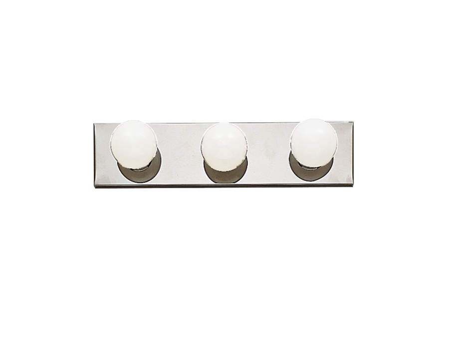
UTILITY


"Look for familiar shapes, no ornamentation, unencumbered light output."