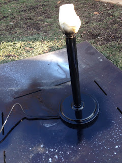
For class we had to find a working lamp that we wanted to redo. I found mine at Goodwill for $3.38. It was a medium size lamp with a white base and shade where the shade had ribbon glued around the shade. I decided to make this lamp a black and silver lamp that's 'blinged out'. First I put a layer of primer, which I got at Hobby Lobby, on it and let it dry. Next, I pulled all the ribbon off the shade and sprayed primer on it also. Then I sprayed three layers of black glossy spray paint, which I also got at Hobby Lobby, on the base and cord, letting it dry in between layers. I only sprayed one layer of black spray paint on the shade. Next, I sprayed 2 layers of glitter spray paint on the shade to add a little glitz. With the shade I painted the the whole thing black; the outside and the inside because the inside of the shade was white which I didn't like. I got the glitter spray paint at Hobby Lobby where I also found little round and square mirrors that I chose to put on the base of the lamp and around the bottom of the shade. Something to keep in mind when doing lamps, is that what you do can affect the light output and if this lamp is needed for task lighting then you need to mindful of what can decrease the amount of light the lamp gives off. With this lamp, since I chose to paint the lamp shade black, it doesn't give off a great amount of light. This lamp will be more for decoration or mood lighting. I only spent $20 at Hobby Lobby for the materials so I didn't spend more than $25 on this lamp.Ultimately, I am very happy with the end result and can't wait to put if to use.
Sunday, December 8, 2013
Tuesday, November 19, 2013
FIX IT OR FORGET IT?
 "That chair sure would make a nice addition to my home but it looks in need of too much tlc!" Isn't this what you say when you see an old piece of furniture somewhere. There is so much potential in these pieces but they get overlooked for newer, cheaply built pieces of furniture because they are a little worn and need a little fixing. When it comes to older pieces of furniture, a lot of people don't want them because they don't look the greatest but that can be remedied by re-upholstering it and cleaning up the woodwork. You can get some great finds at places like flea markets or second hand stores. A lot of people have problems with knowing what's worth putting money into and what's not. What you want to look for is the quality of the furniture. Age plays a part in deciding to re-upholster but if there is no quality in it, then it's not worth it. The first steps after finding a keeper include figuring out where and who this furniture will be used for, how it will be used and how firm it needs to be based on what it's used for. To the right, is an example of some tools that can be used when re-holstering furniture.
It's important to know what goes underneath the fabric. Just because you can't see it doesn't mean it's not important. For example the second picture below features midcentury dining chairs which show the multiple layers underneath. First you have the jute webbing and foam, then goose down or in some cases upholstery foam depending how expensive you want to go. Next is a layer of polyester or cotton batting then the fabric. This is probably one of the most important steps, this is a where a major part of the integrity of the piece comes from. This right here is the meat of any chair or sofa.
 Something to keep in mind when re-uholstering is the fabric selection. Yes, you want something that looks good but you also have to think about the durability and how it will fare after being used. Here's how they break it down. WORKHORSES-is for the pieces of furniture that are constantly used. They recommend tightly woven indoor-outdoor textiles that are water and stain resistant. MIDRANGERS-is for the pieces of furniture that are used but not that often. Some silks and cotton velvets can be used but are prone to marking. DELICATES-is for pieces that are a look but don't touch. Fragile fabrics such as silks, brocade, damask, satin, and linen aren't ideal for sitting on but make a great statement piece. You also want to use screen printed or embroidered by hand fabrics on these pieces as well.
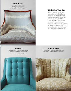
One of the last important decisions in re-upholstery is the finishes. You can do anything from tufting to nail head trims. The finishing touches are where a lot of the fun comes in and this helps make the chair your own.
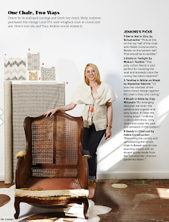
Below are two examples of the multiple ways you can make the same chair look different.
This blog and photos was referenced from The Lonny Magazine-the October 2013 issue, article "The Lonny Guide to Upholstery" written by Allegra Muzzillo and photographed by Genevieve Garruppo
They got a lot of their information from
Wednesday, November 6, 2013
"ON A GRAND SCALE"
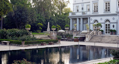
For this week's blog, I decided to share the article "On a Grand Scale" from Elle Decor out of the November 2013 issue, because in my class our next project is about global, ethnic and cultural design. This house is located in New Delhi, India and was designed by French designer Jean-Louis Deniot for Moin and Nasreen Qureshi who are prominent meat exporters in India. They purchased the five acres of land where the house now sits, but was originally just a plot of land with a pond and trees. The house is 25,000 square feet with 5 bedrooms and was built around a photograph of Picasso's 19th-century Villa California in Cannes. Nasreen wanted the house to look like it was 100 years old and she wanted to be able to see the gardens when you step in the front door. Her husband however didn't want the house to resemble a French house located in India. He wanted the inspiration to come from the architecture of Edwin Lutyens in New Delhi. Throughout the house there is a mix of both. However, most of the furniture and lighting was made in New Delhi. Building this grand scale house was a five year process where Deniot had to make adjustments because the cultural is different there than in western culture. For example, they are limited in textiles so they won't print off any more than is needed. He also said that if he drew up something, then he would have a sample in 15 minutes because the carpenter would set up his studio on the property which you won't see happen in the western culture.
Resembles classic architecture with the columns, arched windows and quoining. One of the things I love is the Indonesian umbrellas because they help bring some culture to this grand exterior.
I love the 18th Century French inspired railing along with the Venetian-glass pendants. I also like the way the pattern on the marble floor is reflective of the empire style table. The niches in the stairwell also add a dramatic touch.
This is the drawing room where the fireplace, mirror, sofas and stool were custom made. Deniot himself designed the 18th century style paneling along with the rug. I love the how the shape of the sofas are reflected in the chandelier.
This is the other side of the drawing room.
This is the winter garden. The mirror and trellis design is custom made which is seen throughout the space, even on the ceiling. The window draperies are of an Italian Linen while the marble floor is was inspired by the dining room floor at the Chateau de Groussay. I love the the light fixture and how it is reflective of vines and leaves you would see outside.
This is the sitting area in-between the master bedroom suites. The daybed was found at an England auction while the chandelier was made in 1880 in France. The cocktail table, chair, and secretary were all custom made. The marble floor has the same pattern as there was in the winter garden.
This is the husband's bedroom and the headboard, canopy and light fixture are all custom made.
Above is a Art Deco cocktail table. The paneling is custom designed and feels very masculine.
In the dining room they have Klismos chairs with a custom made table. The Directoire-style chandelier was made in India. Deniot designed the hand painted ceiling where the circles are reflective of the floor. I also like how the rug resembles the marble floor in the winter garden and sitting area.
This is the library where the cocktail table and the rug were custom made. The chandelier is from the 19th Century and is very unique. I love the compartmentalized ceiling and doors, gives it an old world feel. I also love the round niches by the ceiling.
Monday, October 21, 2013
DON'T BREAK THE BANK!
When it comes to kitchens, we all know that new trendy looks usually aren't cheap and we also know that most people don't want to spend a lot of money updating their kitchen. Here are a few ideas to keep up with the trending styles that won't break your bank.
TREND #1-BOLD COLOR SCHEMES
Repainting your whole kitchen can be a bit of a chore and a lot of money depending on how big your kitchen is. I had to buy a gallon of paint just last weekend and couldn't believe what i had to pay for it. And who's to say that you won't get tired of that bright color in a year. You might consider adding in your pops of color in small doses so it's easy to change out. Some Tips to keep this look under $50;
- Add small updates to your existing scheme with a trendy new color
- Use colorful accessories such as a teakettle sitting on the stove
- If you have cabinets that are see through or don't have doors you can paint the back wall of your cabinets
- Use a bright valance that frames a window and adds a pop of color
TREND #2-SLEEK EURO-STYLE
This style is all about the calm simplicity but simple doesn't always mean cheap. Some Tips to keep this look under $50;
- Start by de-cluttering countertops and shelves. It costs nothing to clear your contertops and helps create the sleek-Euro style
- Get floating shelves to replace wall cabinets to get the European style
- You can also paint the cabinet doors with a high gloss finish in a neutral color
- Simple white cabinets with a similar shade on the surrounding wall or backsplash creates a modern, monochromatic look and these can easily be painted
TREND #3-TRICKED OUT CABINETS
The newest trends in kitchen cabinets have "rich finishes and gorgeous hardware" which can also be known as expensive. These cabinets have things such as built in organizing components but also adds more to the price tag. Some tips to keep this look under $50;
- You can get a nice finish in the hardware
- Buy inexpensive drawer dividers that give you the organization
TREND #4-STATEMENT LIGHT FIXTURES
"One great light fixture can transform the look of the entire kitchen," Morisseau says. Lighting can be used to create emphasis and drama in certain areas but can often be overlooked. Some Tips to keep this look under $50;
- Keep an eye out for sales. You can also look at garage sales or flea markets and find inexpensive lighting that may need to be rewired but won't break your bank
- You can change the finish of a light fixture with metallic spray paint
- Buy a trendy drum shade that can be hung with a pendant cord kit at Ikea for $5
TREND #5-INDUSTRIAL CHIC
Industrial chic is more commercial looking with bigger appliances that are usually stainless steel and are also really expensive. Some tips to get this look for under $50;
- Use "gleaming metals" throughout the kitchen helps create the feeling of industrial chic
- Find high end accents at a discount such as a stainless steel toaster that would sit on your countertop or a metal canister filled with utensils
- Place a hanging pot rack above a range or island
- Hang a stainless steel shelf that will show off some cookware
TREND #6-MARBLE OR GRANITE
Stone countertops is the popular trend and has been for awhile. It looks great and is very durable but comes with that all too dreaded high price tag. Some tips to get this look for less;
- Use stone in a small area such as an island or prep zone and then use a different complimentary countertop on the rest. You can look for remnant slabs of stone because you aren't doing your whole kitchen and it will be extremely cheap because a lot of people don't have a use for a little slab.
- Use a marble slab pastry board and keep it out all the time
featured in CONSUMER REPORTS-KITCHEN PLANNING & BUYING GUIDE
December 2013 issue
WHERE THE PROS GET "CHEAP-CHIC DEALS"
ACCESSORIES
- bedbathandbeyond.com
- art.com
CABINET ORGANIZERS
- containerstore.com
- stacksandstacks.com
- shelvesthatslide.com
HARDWARE
- niftynob.com
- overstock.com
LIGHT FIXTURES
- lightinguniverse.com
- ikea.com
- pbteen.com
INDUSTRIAL CHIC
- walmart.com
- amazon.com
Tuesday, October 8, 2013
LIKE ICING ON THE CAKE!
"IT'S A MUCH NICER LOOK, I SAY IT'S LIKE PUTTING ICING ON THE CAKE. IT JUST ADDS THAT MUCH MORE PIZZAZZ TO THE KITCHEN".
-SAYS GARY SCHMIDT REGARDING BACKSPLASHES IN A KITCHEN.My blog this week comes from the article 'Backsplashes are bigger than ever-literally' by Anne Kapler featured in The Gazette which can be found around the Cedar Rapids area. This article talks about how backsplashes add a great deal to a kitchen and how they actually serve a purpose. They never used to be used because people were afraid it would be hard to clean in between the grout lines. But backsplashes keep splatters from staining the walls and actually make cleaning easier because you can just spray and wipe. With regular painted walls, you can get staining, water marks, and sometimes have to worry about taking the paint off. White ceramic subway tiles and colorful glass tiles that are installed from the counter to wall cabinet are extremely popular. Sometimes people even bring the tile all the way to the ceiling. While they are really popular there are other options which include porcelain, stone and various exotic materials.
Backsplashes are a nice way to add something extra to your kitchen. All kitchens have cabinets and appliances that vary depending on style but a backsplash is one element that can make a kitchen stand out.
Mary Jo Peterson who is a columnist for Kitchen & Bath Design News, says that there is a way to have a backsplash that is easy to tear down if you want something different or if you want to go bold but are afraid you won't like it. She suggest installing a backsplash on a removable board instead of directly onto the wall.
Below are some examples of different ways to incorporate backsplashes into a kitchen:
Wednesday, September 25, 2013
OH, TO BE IN ENGLAND!
"London Calling" written by Lisa Cregan was published in the October 2013 addition of Traditional Magazine and talks about how after living in London for 10 years, Lynn Eichenberger and her family sadly moved back to the United States after her husband was relocated and how she and architect James Wagman and interior designer Celerie Kemble turned her Manhattan duplex into a "place with the kind of Old World character and grace their homesick client had grown accustomed to". The space was completely gutted where they could almost completely start from scratch. They kept the design traditional yet at the same time finding ways to make it interesting. For example, the dining room, with the dark paint, painted on not only all the wall but all the molding and trim as well. Throughout the home is antiques and ceramics the Lynn has collected while living in London. When looking at these pictures I see a kind of the old world charm you find in Europe. While living in Manhatten, the Eichenberger family should feel right at home!
Tuesday, September 10, 2013
BLACK AND WHITE: TOGETHER FOREVER
"EVERY ROOM NEEDS A SLAP IN THE FACE"
-Dransfield and Ross co-owner Geoffrey Ross
A lot of people say that nothing is ever just black and white. Well, I disagree! Some of the world's greatest things come in black and white, such as;
 |
| OLD MOVIES |
 |
| PIANOS |
 |
| HOSTESS CUPCAKES |
 |
| PAGES OF A BOOK |
I could go on and on! It's like black and white were always meant to be together. In the article "Bold Moves" by Tori Mellott and Mimi Faucett in the September 2013 issue of Traditional Home Magazine, they go through what to do when designing in black and white. One of the tips talked about is how you should combine a soft black with a creamy white. If you pick a harsh black with a bright white it creates a high contrast which often is too harsh.
What's great about using black and white is that you can add in almost any accent color. They say you should steer clear of yellows and oranges as accent colors because they resemble bees and Halloween otherwise but they can look great if done right!
They say white subway tiles and black soapstone countertops in a kitchen look really great along with using an oversized black and white wallpaper in a powder room or even a hallway.
Great paints they tell us to use when using a black and white color scheme are "Off-Black" from www.farrow-ball.com
"Onyx Black" from www.glidden.com
Subscribe to:
Comments (Atom)

